
Design
Indie Concert Poster Design: Bold Collage Ideas Inspired by TV Girl Aesthetics
Indie Concert Poster Design: Bold Collage Ideas Inspired by TV Girl Aesthetics
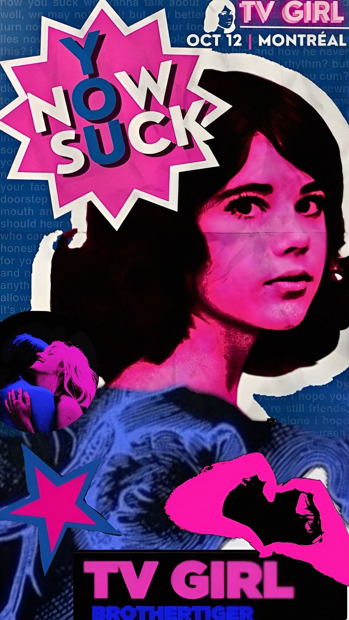
The poster image uses bold pink, blue, cutout shapes, layered portraits, and oversized typography. It has the energy of an indie music flyer that wants to be noticed from across the room.
This style is useful for concert graphics, playlists, fan art boards, moodboards, and social posters.
What Makes the Style Work
The design combines high contrast color, collage edges, expressive type, and a strong central face. Those choices create movement and attitude even before the viewer reads the details.
Key Design Elements
- Neon pink and electric blue color pairing
- Cutout portrait layers
- Sticker-like starburst shapes
- Bold title typography
- Background texture or repeated text
- Small secondary graphics for rhythm
How to Build a Similar Poster
Start with one main image, choose two strong colors, add a large headline, then layer supporting shapes around the focal point. Keep the hierarchy clear so the title remains readable.
Avoid Visual Clutter
Collage works best when chaos is controlled. Leave some breathing room and repeat colors so the poster feels intentional instead of messy.
Final Thoughts
A bold indie poster can feel nostalgic, loud, and stylish when strong color and clear hierarchy work together.