
Design
Red Poppy Poster Design: Vintage Floral Graphics for Inspiration
Red Poppy Poster Design: Vintage Floral Graphics for Inspiration
Explore red poppy poster design ideas, vintage texture, Japanese-inspired typography, warm palettes, and ways to use floral graphics creatively.
This image-inspired guide expands the idea into a practical, easy-to-read article with simple takeaways, creative context, and everyday examples.
Why the Poppy Works Visually
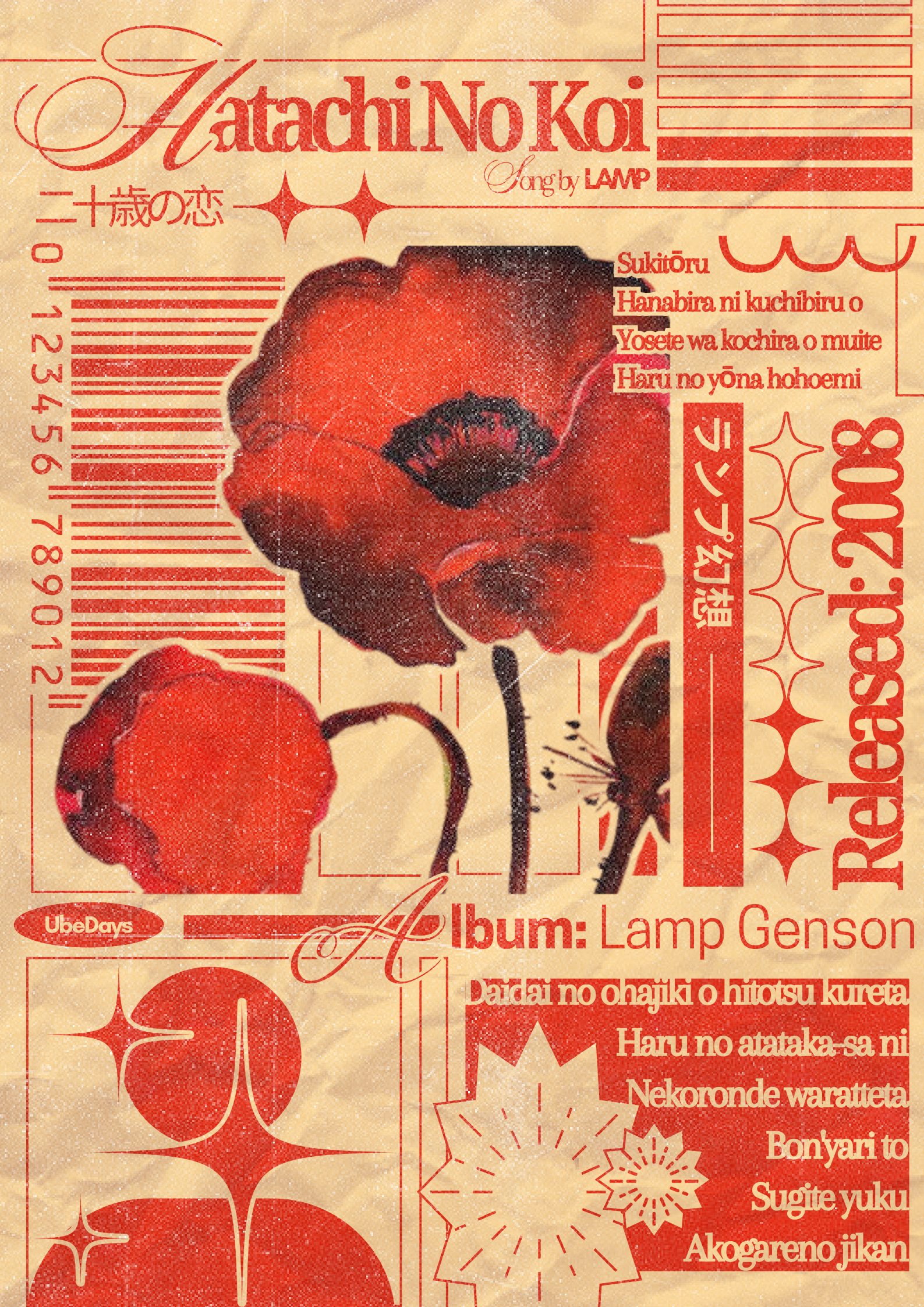
A red poppy has immediate visual impact. Its bold shape, dark center, and saturated color can carry a poster even when the rest of the palette stays simple.
Design Elements to Notice
The image combines warm paper texture, barcode-like lines, ornamental symbols, and layered typography. These details create a collected, printed, almost archival feeling.
How to Use This Style
- Limit the palette to red, cream, black, and one muted accent.
- Mix large floral shapes with small technical details.
- Use worn paper textures for depth.
- Balance decorative type with readable blocks of text.
- Leave some breathing room around the main flower.
Best Projects for This Look
This style works for wall art, journal covers, album-inspired graphics, stationery, packaging mockups, or mood boards with a romantic vintage tone.
Final Thoughts
A strong floral poster does not need many colors. With one confident flower, texture, and thoughtful type placement, the design can feel both nostalgic and modern.