
Design
Monochrome Sneaker Poster Style: Streetwear Graphics With Bold Type
Monochrome Sneaker Poster Style: Streetwear Graphics With Bold Type
Study monochrome streetwear poster design, sneaker imagery, bold typography, contrast, fan-poster layouts, and editorial graphic inspiration.
This image-inspired guide expands the idea into a practical, easy-to-read article with simple takeaways, creative context, and everyday examples.
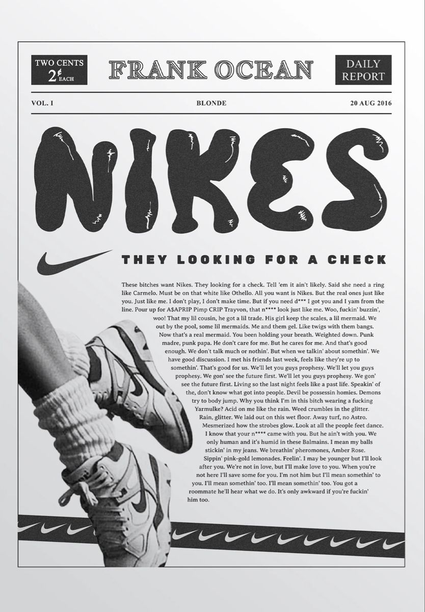
Why Black and White Works
A monochrome palette makes shape, contrast, and typography do the heavy lifting. It can feel clean, gritty, editorial, and timeless all at once.
Elements That Create the Look
- Oversized display lettering.
- A newspaper or report-style header.
- Close-up product or footwear photography.
- Small repeated graphic marks.
- Dense body text used as texture rather than the main focus.
How to Recreate the Mood
Use one strong photo, crop it confidently, then build a layout around type hierarchy. The goal is not clutter; it is controlled visual energy.
Where This Style Fits
This approach works for streetwear mood boards, editorial posters, music graphics, zines, product inspiration pages, and social content with a fashion edge.
Final Thoughts
A strong streetwear graphic feels intentional even when it looks raw. Contrast, crop, and type scale make the design memorable.